Draft of my booklet
I made my draft by hand, because the whole ''outside'' design of the book is more important.
Learning new programmes for designing architecture. Step by step. One problem at a time.
četrtek, 31. maj 2012
ponedeljek, 21. maj 2012
wk12
četrtek, 17. maj 2012
wk11
Photo montage
photoshop cs5
First I want to say that in year 2010 I attended a contest by Eunic ''Postcard from the future''. We had to represent (a specific city) how our future will look like because of the pollution. I was in top 10 :)
This is what I made (in photoshop) (I cannot find the original)
photoshop cs5
First I want to say that in year 2010 I attended a contest by Eunic ''Postcard from the future''. We had to represent (a specific city) how our future will look like because of the pollution. I was in top 10 :)
This is what I made (in photoshop) (I cannot find the original)
Our picture was given to us in a frame as an award :P
1./ I will do a montage of my 3D object with Photoshop. One will be imaginary and two with real location.
2./ I always wanted to do an underwater world!
torek, 15. maj 2012
wk10.2
petek, 4. maj 2012
wk10.1
Helvetica
movie 2007
As I mentioned before, I went to high school for graphic design. We spent a lot of time designing magazines, our own fonts, catalogues, stamps, ... And I noticed, on the street, almost every single poster is made with Helvetica. We know gazillions and gazillions of other typefaces. Some are useless, some are just idiotic, some are okay, .. But just because Helvetica is one of the perfect font (it is beautiful), it is overused. Like someone said, it is neutral and has no expression whatsoever. I like fonts that has some kind of personality, not just: Hi, I'm here. That's all. One of my favourite fonts are Calibri . It is simple, but when you see it, it shows some playfulness and organization at the same time. I use it almost every time, but I never forget about other fonts. Sometimes you need serif-fonts or chaos-fonts. What your assignment needs and it all depends on the designers taste.
wk10
Camera, Lights, Render
3ds max 2012
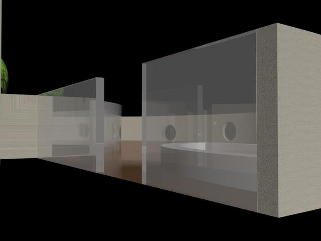
1./ Rendering my object by camera and adding lights
2./ Still has no lighting and background.

This is how it looks when I add standard light:
I had so much trouble with Max (even assistant Lovrenc could not help me), it took me a while to put things together.
Max is messing with me :(
Did I mention my file is damaged?
3./ I tried to use this tutorial.
4./ I cannot do anything anymore. It is stressful, annoying, hard and unsolvable. Everything is destroyed and because I am so enthusiastic about learning new programs until my head hurts, I will do a new assignment, different one. Nothing will be round, definitely!
3ds max 2012
1./ Rendering my object by camera and adding lights
2./ Still has no lighting and background.

This is how it looks when I add standard light:
I had so much trouble with Max (even assistant Lovrenc could not help me), it took me a while to put things together.
Max is messing with me :(
Did I mention my file is damaged?
3./ I tried to use this tutorial.
4./ I cannot do anything anymore. It is stressful, annoying, hard and unsolvable. Everything is destroyed and because I am so enthusiastic about learning new programs until my head hurts, I will do a new assignment, different one. Nothing will be round, definitely!
Naročite se na:
Komentarji (Atom)


